Trends
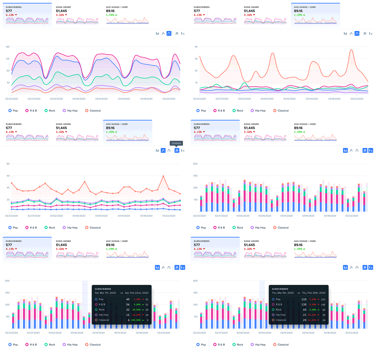
Checkout our SaaS and eCommerce guides for more example Trend reports.
Overview
Trends Reports allow you to visualize patterns or movements in your data over time that would be difficult to measure in a Journey or Retention Report. What's really powerful about Trends is that users can define any combination of user segments and dimensions on the fly. Right off the bat, Trends can help you answer the most complicated questions with a few clicks by leveraging custom events(link) and segments(link).
Woopra’s Trends reports can help you explore several dimensions in your data that may not have been recognizable at first. Woopra gives you the flexibility to effortlessly analyze any combination of customer segments, behaviors and events that affect your product usage over time.
How to create a Trends Report
Identify The Focus
You will need to ask three main questions:
- Who are you tracking? Meaning, what group or segment (link) of people do you want to include in this report?
- What events do you want to analyze over time?
- How do you want to group or compare these results?
Build the Report
Now that you know what you want your report to focus on, we can start building the report.
Configurations
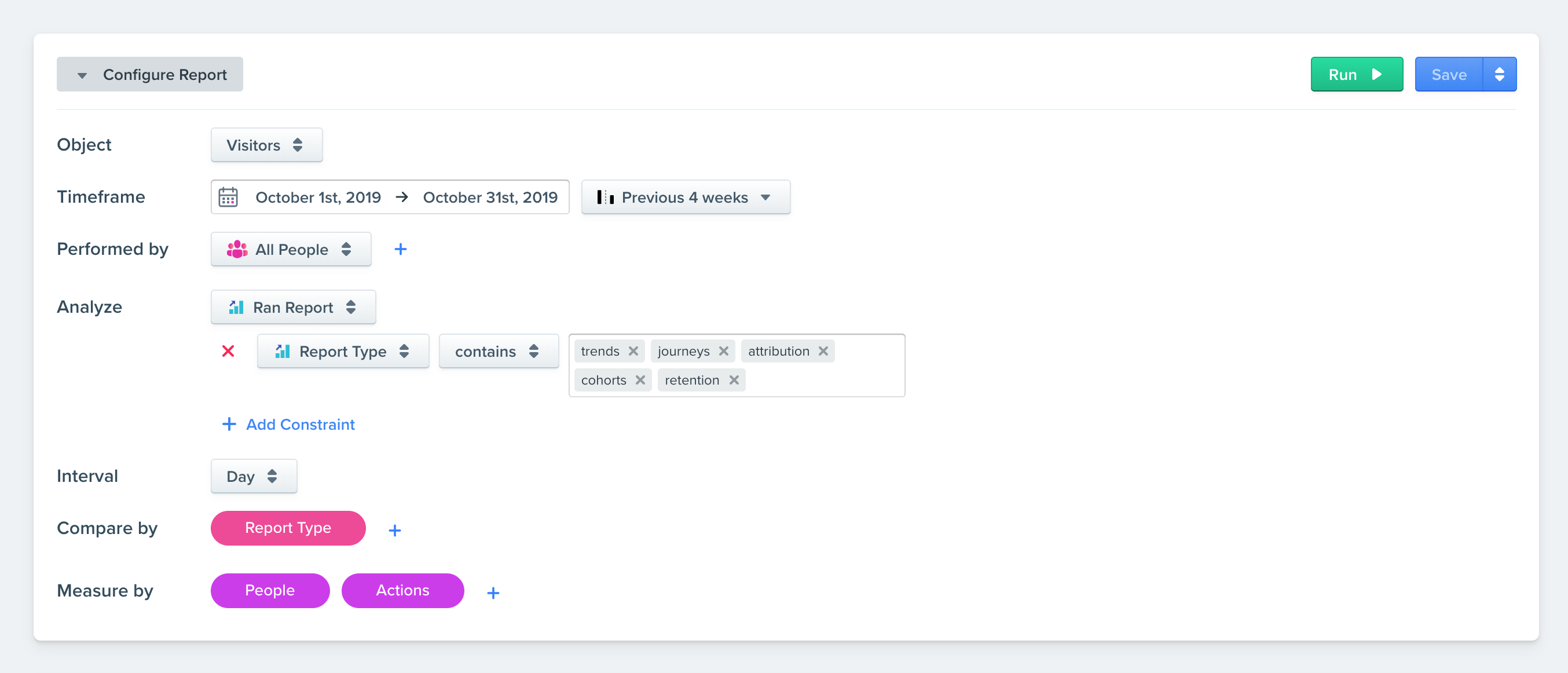
Trends Reports are comprised of 6 sections: Timeframe, Performed By, Analyze, Interval, Compare By, and Measure By.
Timeframe
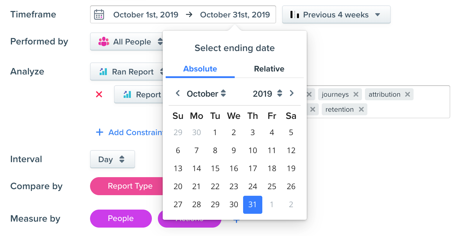
This is the first metric you should choose. Here, the timeframe is the period in which Woopra will examine all your data of users that did at least 1 event during that time frame. You can choose a relative date such as today, last 7 days, last 30 days, last 90 days, last 365 days or any absolute date range of your choice. The default date range is the last 30 days. We choose the last 365 days for this example.
Compare to the Previous Timeframe
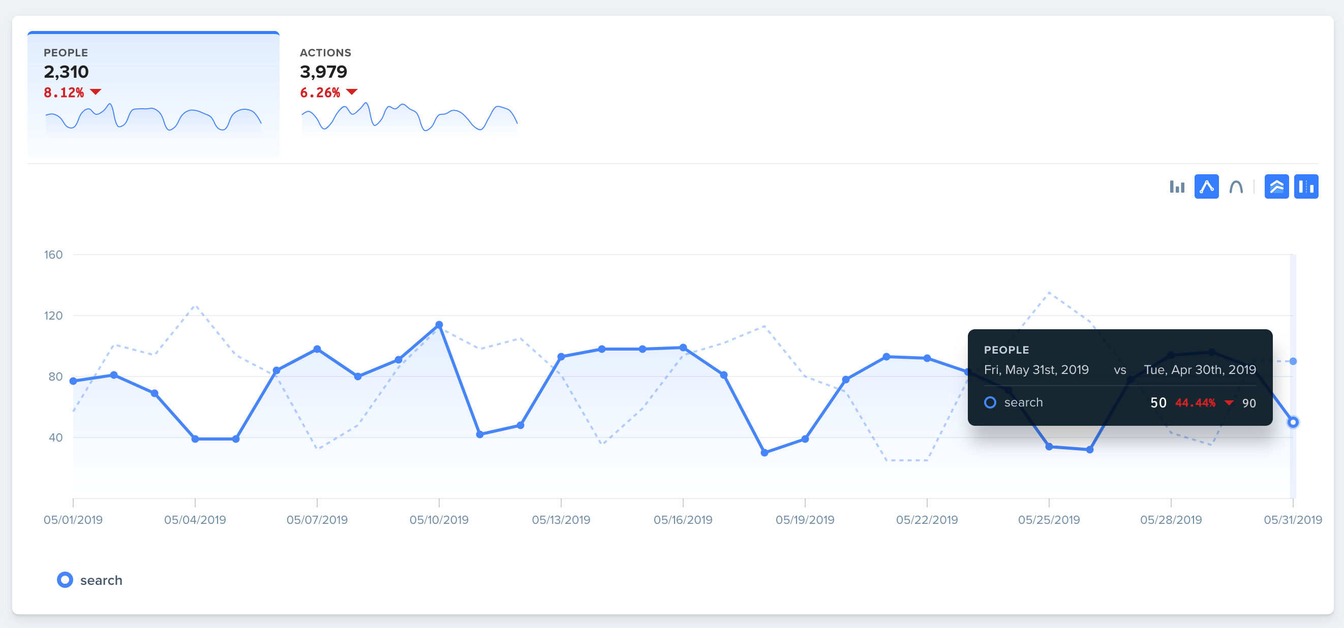
Next to the Timeframe is where you can select the comparison to compare the results of the chart to a previous period. Here you can select an absolute or relative timeframe as your comparison. If you selected the timeframe as May 1st to May 31st and select 'previous day', the displayed report will show a comparison of the previous day for each day on the chart. For example, on May 2nd will show you the comparison to May 1st.
If you selected 'previous month', the overlay will be a comparison of the previous month. Here, we're selecting the “end date” of the previous range we’re comparing. So if comparing May 1st to May 31st, selecting 'previous month', the last date comparison will be the end of April compared to the end of May (see picture below).
Performed By
Think of this step as the segment or group of people you'll be analyzing. Either select an existing segment or create a new one on the fly, by clicking the “+” button in the “Performed By” section of your configuration. More info on how to create a Segment can be found here: Segments
Timeframe differencesIt is important to understand the Performed by timeframe configuration differs from the Timeframe configuration above. The Performed by timeframe will create a subset population of people from the Timeframe configuration section.
For example, let's take the following scenario -- You want to run a marketing campaign to target users that are currently active and also made a purchase on last year's Black Friday. First, you would set the Timeframe to the current month to select an initial group of ALL users that have performed at least one event in the current month. Next, under the Performed by timeframe, you select the event “purchased item” with the date for last year's Black Friday. Now, you will have a list of all active users from the past month that purchased an item last Black Friday. Typically the Performed by timeframe is less than or equal to the Timeframe configuration range.
Also here's a quick video explanation as well: https://share.getcloudapp.com/E0uzzAvP

Woopra supports nested segmentation filters as well as the ability to combine filters using AND / OR parameters. Additionally, you can add a split group to segment by multiple events or attributes.
Events
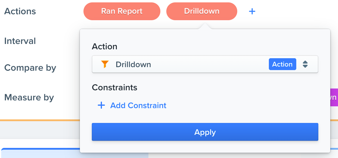
These are the events you would like to analyze over time. With our most recent release, we have enabled the analysis of multiple events in Trends. You can click the '+' button next to the event to add multiple events.
Interval
This is the time interval for the chart. This can be by hour, day, week, or month.
Compare by
These are the dimensions you want to analyze and compare. These can be comprised of multiple dimensions that we can group by. Comparing any of these properties alongside each other makes Woopra’s Trends an extremely powerful feature for analyzing customer behavior.
The properties will be determined by the events you select. For example, if you selected to analyze a pageview event, you might see properties like URL, Title, Domain, etc.
Measure By
This tells Woopra the metrics you want to analyze. By default, this field includes People, Visits, and Events.
- 'People' is the count of unique ids of people who performed the event you want to analyze
- 'Visits' is the number of times this unique group of people visited your web or mobile app and performed the event you want to analyze (request a report, in this example) during the specified timeframe
- 'Events' is the number of times this unique group of people performed the event you want to analyze (request a report, in this example) during the specified timeframe.
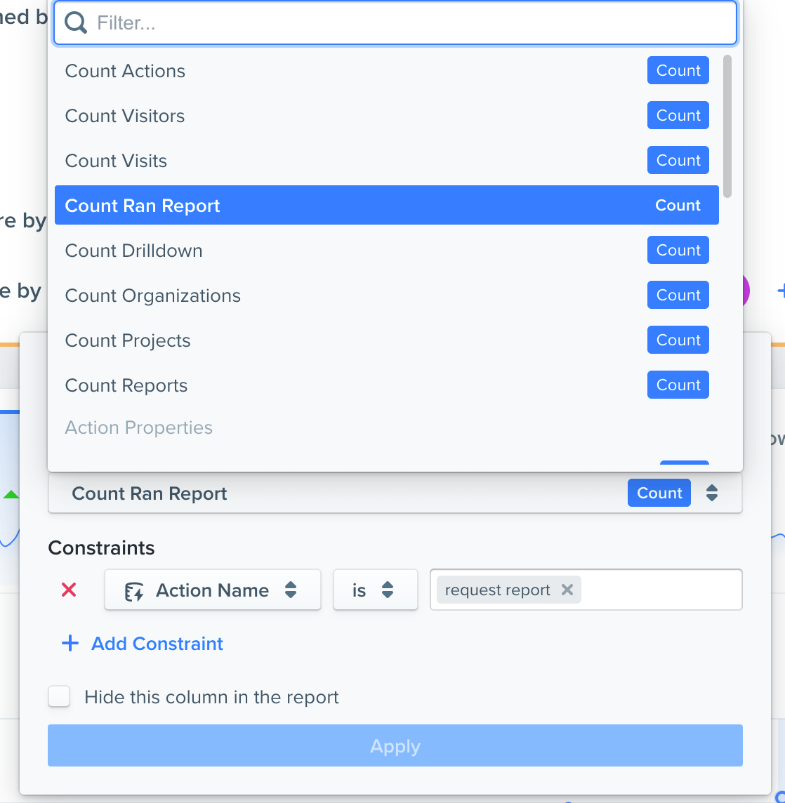
You can also add constraints to measures. For example, to show a count of users who did a specific event, you can define what is included in the count totals.
Chart Metrics
The upper left of the report will show a total number of People, Events, and Visits for the selected time period.
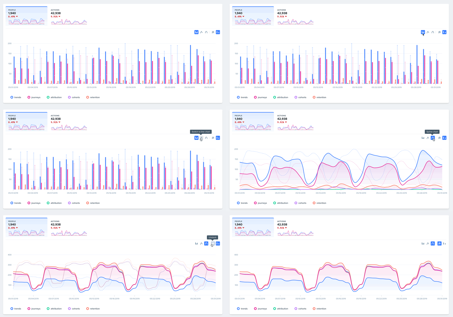
You can change the visualization of the report to a bar, line, or spline chart. You can also change whether the chart type is stacked or not. Lastly, you can hide the comparison from the chart as well.
Formulas
You can perform row-based operations by using formulas. For example, if you wanted to find the average session length, you could add a formula row that divides the session length by the number of sessions (visits).

Average Session Length Calculation
For more info, see our documentation on Formulas here
Comparing Rows
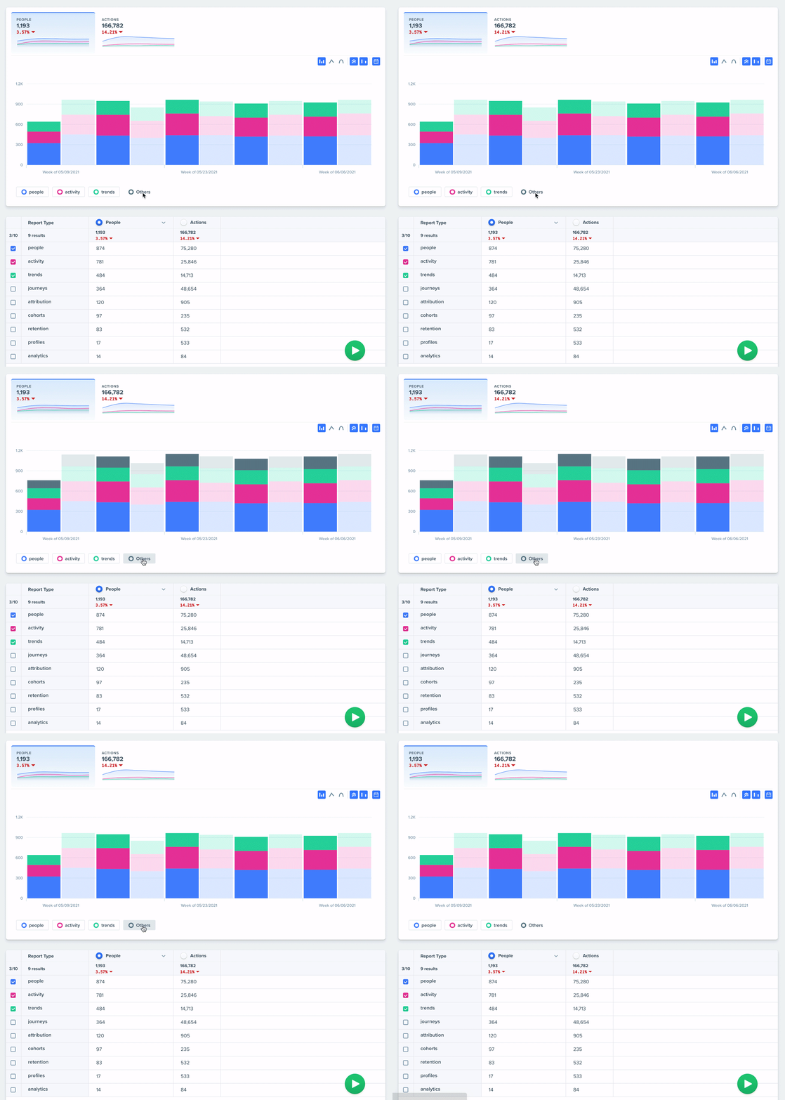
You can select rows that you want to compare by in the visualization by clicking the checkbox next to the row and re-running the report.
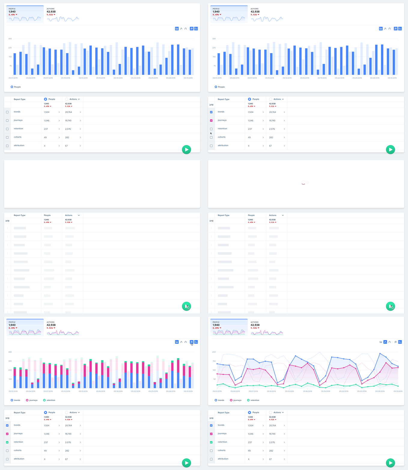
Toggle "Others" view by clicking on others.
Exporting and Sharing
Now that you've built your report, you'll want to share it with your team. You can do this by clicking on the 3 dots / ellipsis which will open an options menu for exporting, sharing, tagging, pinning, duplicating and reloading your report.
Downloading
You can download the report in various formats: CSV, CSV (raw), PDF or HTML. Note that CSV (raw) will download some columns, such as average_session_length in total seconds. Exporting the regular CSV for these columns will download timestamps in a string format, e.g. 3 minutes, 21 seconds - 8 minutes, 20 seconds.
Sharing
Remember, reports are not shared with your team by default, so you will need to share it for others to access it. Click share from the menu and select what team you want to share your report with.
Snapshots
Snapshots generate a URL of the report you want to share. You can share this URL with anyone, whether they are apart of Woopra or not. This URL will link to a snapshot of the report you have created.
To take a snapshot, click the ellipsis and select snapshot. This will copy a URL for you to share. This is a public link, so anyone with the link will have access to that snapshot. This is an easy way to share reports with external teams or anyone whom you want to share the report with.
Editing the report will not change the snapshot, since the snapshot is a view of the report at the time when the snapshot was created.
Updated 6 months ago
